1621
All You Need to Know About Building a Furniture Website
11 Mar, 2021
2 min read
1621
11 Mar, 2021
2 min read

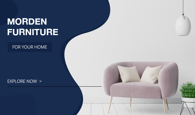
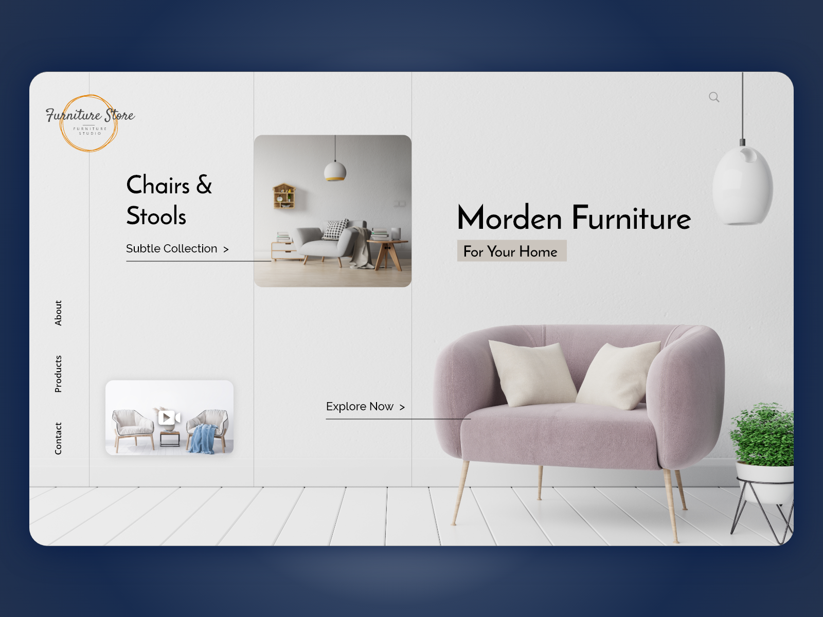
The process of designing an eCommerce store for furniture isn’t about dazzling colors and excessive information. When you look at some of the most popular furniture stores, they are minimalist, have neutral colors, and easy search functionality. Wogg for instance uses a neutral white background. It has a clickable gallery, and the pictures take a huge amount of the website’s space. On clicking the image, the user gets to read the product content.
To avoid clutter, ensure that the layout is simple yet effective. For example, display the logo and the pages like the product category, About Us, Shopping Cart, etc. at the header. Implementing search filters will ease the searching process.

The key to design a furniture store website is to keep things simple. Most designers tend to overload the site with tons of features and information to make it look catchy. But for the user, going through excessive information is a headache. Let’s help you create a user-friendly interface for your store.
All product and company names are trademarks™, registered® or copyright© trademarks of their respective holders. Use of them does not imply any affiliation with or endorsement by them.
If you’re looking for a modern and stylish website for your furniture website, Webflow templates are a great choice. Webflow real estate template, for example, features a clean and minimal design, as well as a range of powerful features to help you showcase your products and services in the best possible light. Webflow templates comes with all the necessary pages and features that you need to create a successful website.

Storyblok
29882
By Devik Gondaliya
02 Apr, 2025

Storyblok
30836
By Devik Gondaliya
01 Apr, 2025

Storyblok
31462
By Devik Gondaliya
27 Mar, 2025