1826
What Building an Intuitive Bike Sharing App Looks Like
12 Mar, 2021
2 min read
1826
12 Mar, 2021
2 min read

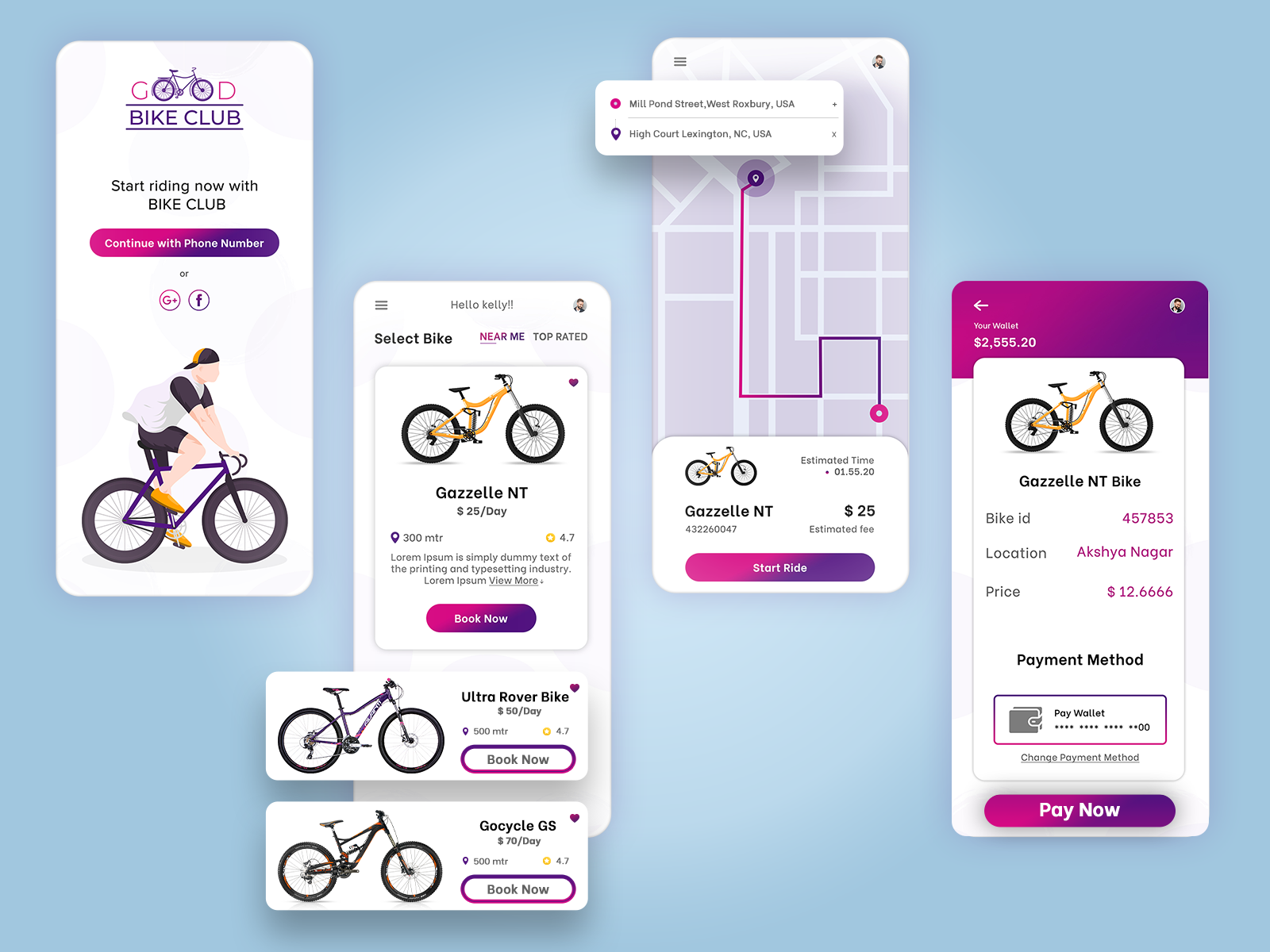
Harry is a typical salesperson. He has to move around in the city at least thrice a day. He found out there’s a bike-sharing app. It’s quick and easy. Now, whenever he has to take a trip, he books a bike, uses a Qr code to unlock it, pays for the ride, and drives away.
That’s the ideal user of your bike-sharing app. The user’s intent to use bike-sharing apps is quite simple – locate the nearest bike in real-time, book one, and reach the destination as quickly as possible. If it’s too complicated then it can leave the user frustrated.
This means, designing a bike-sharing app is not just about how it looks but how it functions. User-centric apps like these need the most ideation. You need to go through hundreds of ideas and share them with users to seek feedback. The process continues till you get a refined idea to capitalize on.

We can help you develop proper prototypes that will give you the end-to-end flow of various functions of your app. Let’s get in touch to see how the eventual product will look like.
All product and company names are trademarks™, registered® or copyright© trademarks of their respective holders. Use of them does not imply any affiliation with or endorsement by them.

Storyblok
28750
By Devik Gondaliya
02 Apr, 2025

Storyblok
29723
By Devik Gondaliya
01 Apr, 2025

Storyblok
30387
By Devik Gondaliya
27 Mar, 2025